


Does BMW Make it into the Best Car Logos of All Time?

Have you ever thought that the BMW’s iconic logo is a propeller? You’re not alone. That question has been a hot discussion for decades, due chiefly to a publicity stunt. Keep reading to learn what the BMW logo really means, how its life began, and how BMW’s transformation is reflected in its new emblem.
Fred Jakobs, the Archive Director at BMW Group Classic says “Many people believe the BMW logo is a stylized propeller, but the truth is a little different.”
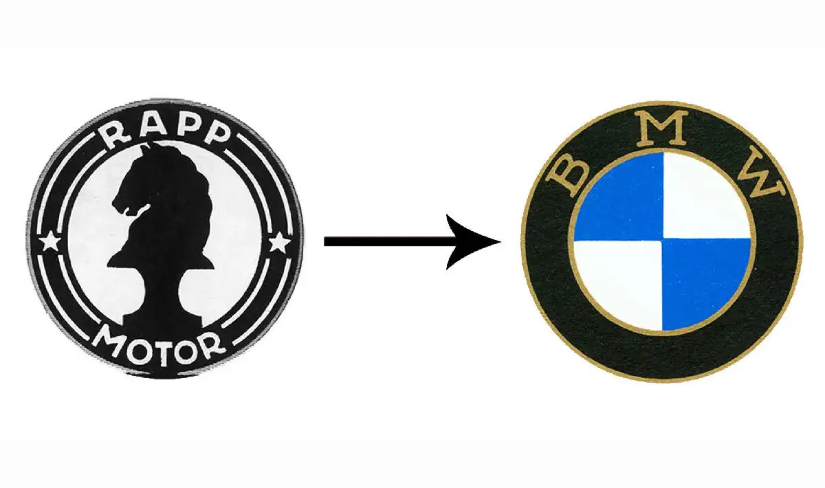
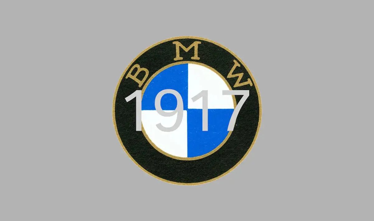
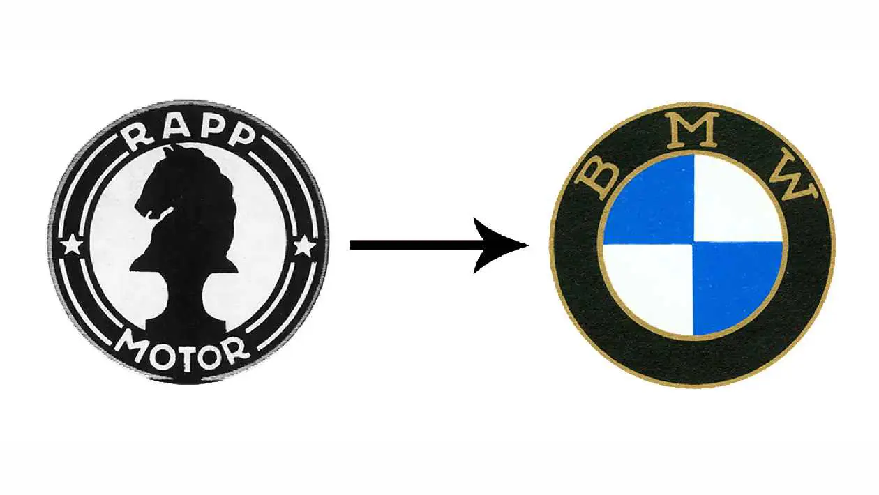
The history of the name BMW dates back to 1917. The Bayerische Motoren Werke or Bavarian Motor Works emerged when the aircraft engine manufacturer Rapp Motorenwerke was renamed. Although the company, located in Munich, the capital of the State of Bavaria in southern Germany, changed its name, the assets, technical equipment, and workforce initially remained the same.
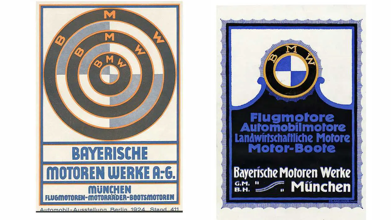
Intriguingly, when its new name ‘BMW’ was first included in the commercial register in July 1917, there was no company logo. Similarly, the first ad was released in the same month, but also lacked any BMW logo or emblem. It did, however, feature alongside aircraft engines its future planned product range: engines for automobiles, boats and agriculture.
“BMW’s logo and its meaning weren’t as present to the public in the early days as they are today, due to BMW having had no end customers to solicit,” says Fred Jakobs. Their primary business was the production and maintenance of aircraft engines for the German Air Force.
Its First Appearence
It was in October 1917 that the first BMW logo appeared, when the company emerged from the firm Rapp Motorenwerke GmbH (1913-1917). The emblem continued Rapp’s tradition of having a black ring around the company logo showing the company name.
Why did they choose to colour the quarters of the inner circle on the badge display white and blue? These are the state colours of the company’s home state of Bavaria. However, these colours are in the inverse order according to the heraldic rules, where you read clockwise from the top left. This was due to the local trademark law at the time, which prevented the use of symbols of sovereignty or state coats of arms on commercial logos.
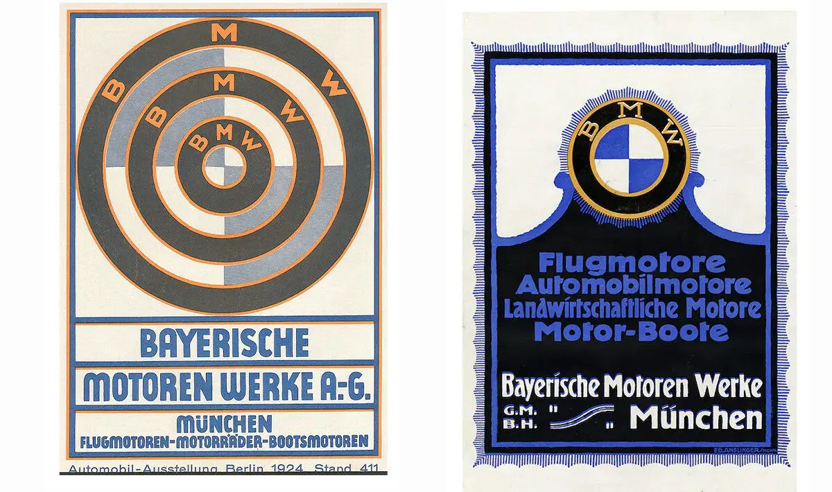
The picture below on the left shows the emblem that BMW used at the motor show in Berlin in 1924. BMW took the picture on the right during its early years, when it produced engines for a wide range of applications, including automobiles, aircraft, boats, and agricultural equipment.
The BMW Logo is a Propeller: Truth or Myth?
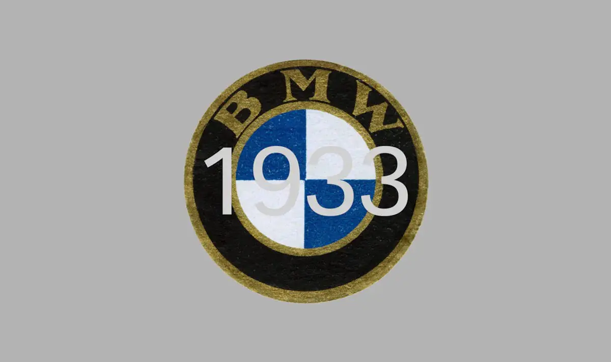
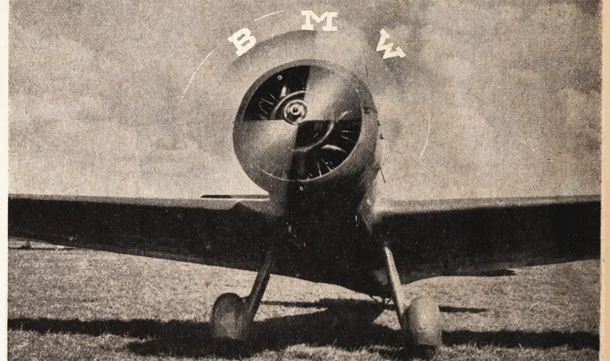
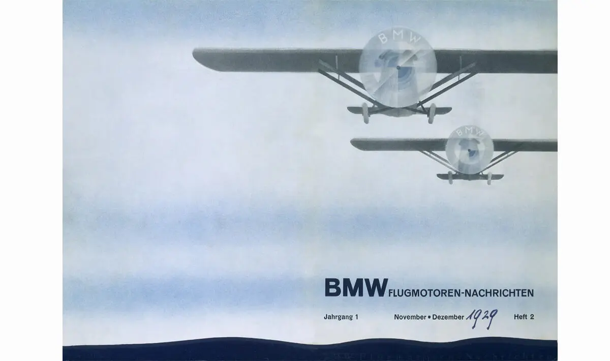
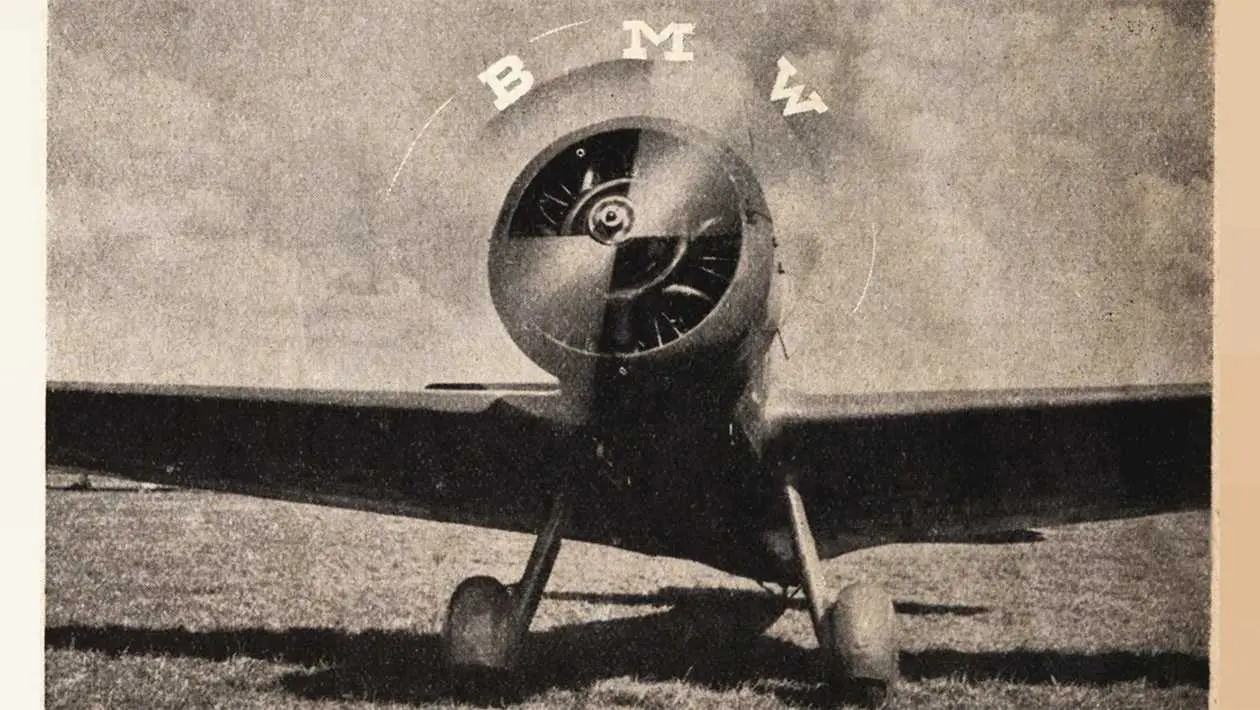
In 1929, a BMW ad depicts the emblem, in a spinning airplane propeller, complete with the four coloured quadrants. At this time the global economic crisis had begun, BMW was trying to announce with this ad a new aircraft engine, built under license from Pratt & Whitney. They rightly felt that the propeller interpretation would fit perfectly into the promotional image of the young company, as it highlighted the company’s roots and its proficiency in aircraft construction. Since this BMW publication the myth that the BMW logo is a propeller has endured.
BMW did nothing to discourage this myth. In fact, in 1942 BMW went full throttle itself, linking the propeller to its company symbol. A BMW publication called “Flugmotoren-Nachrichten” (Aircraft Engine News) released an article that confirmed the story of the BMW badge as a spinning propeller. As you can see from below, the article was illustrated with a photo of the BMW logo overlaid on a rotating propeller.

According to Fred Jaobs, the story of the BMW logo is based on a myth – a myth that still lives on today. “BMW has made little effort to correct this story of the BMW badge being a propeller.” Evidently, repeated retelling has made this theory a self-propagating urban myth. “This theory has been prevalent for 90 years,” explains Jakob, “so in the meantime it has acquired a certain justification.”
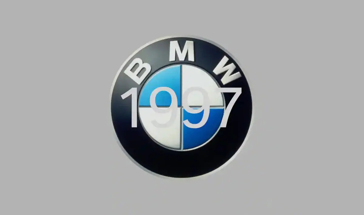
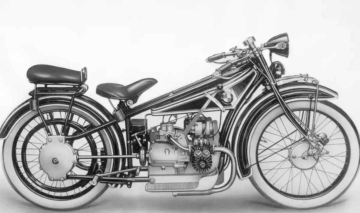
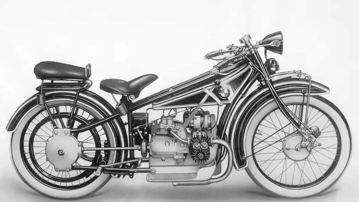
The BMW emblem first appeared on the streets in 1923, on the BMW R 32’s fuel tank, BMW’s first motorcycle.
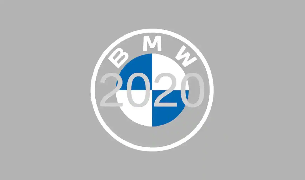
What Does BMW’s New Logo Stand For?
BMW’s latest redesign is more than just a design update. According to Jens Thiemer, Senior Vice President Customer & Brand BMW “the layout of BMW’s new brand look and feel stands for the mobility of the future. The new communication logo radiates openness and clarity, we are a relationship brand.” Jens went on to say “With this new transparent variant, we want to invite our customers more than ever to become part of the BMW world. The emblem symbolises the relevance and significance of the brand for mobility and driving pleasure in the future.”
Despite my appreciation of the BMW logo, it didn’t quite make it into my top 10.
Tap here to find out which 10 logos made it into the best car logos of all time.
Read more on
Would you like us to review a product, service or car?
Get in touch and we can make that happen for you.
Find out moreRelated Stories
Advertisement Advertisement
 Advertisement
 Advertisement
 Advertisement