


Does Alpine Make it into the Best Car Logos of All Time?
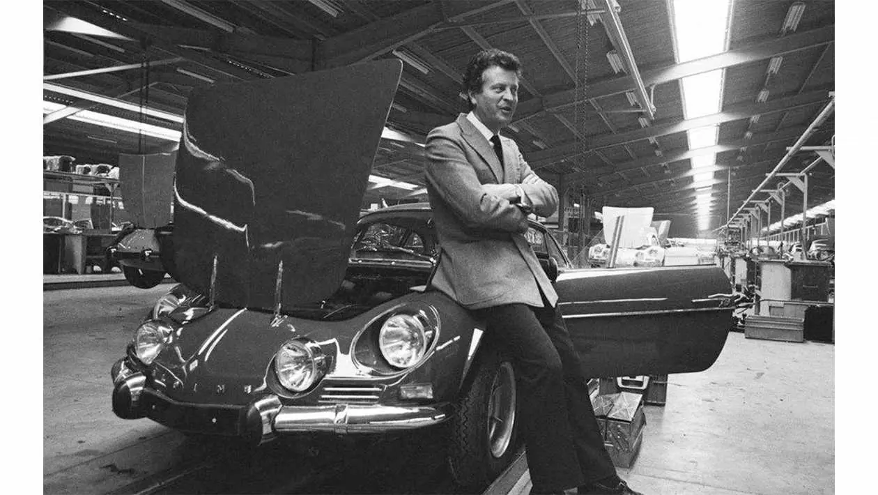
Alpine began its life in 1954, when its founder Jean Rédélé opened the automotive company in Dieppe, France. Alpine’s full name is quite a mouthful: Société des Automobiles Alpine or SAS for short). It was known for its development, manufacturing, and marketing of sports and racing cars. Jean found success in motorsport almost immediately, with the Renault 4CV car, produced after World War II. The company was closely associated with the Renault brand, so it came as no surprise that a large corporation bought Alpine in 1973. Their sports departments merged three years later, until in 1995 the production line of Alpine ceased altogether. It was in 2017 that the brand was relaunched, coinciding with the release of the Alpine A110 sports car.
Meaning and History
Jean Rédélé won several significant races driving the Renault 4CV sports car, the motor that is the basis for the brand’s product range. Among these victories were the Coupe des Alpes and Mille Miglia. As Jean’s racing experience grew, it helped him form and design many versions of the Alpine car. One upgrade was producing a model with a five-speed gearbox, as opposed to a three-speed one, and a lightweight fiberglass body. This adjustments helped Rédélé race successfully at the Sebring and Le Man’s races in the early 50’s.
Inspired by the victories, Rédélé opened its racing and sports car production facility, choosing to name the brand after the victory as Coupe des Alpes. Unfortunately, this name caused a slight hiccup for Rédélé because he was unaware that the Sunbeam Alpine sports coupe, based on the Sunbeam Talbot, was presented in the UK in 1953. This brand name confusion did not deter the Frenchman, and he stuck with Alpine for his company to develop the original logo, of which they had three.
1949 – 1954
The first emblem laid out the tone for creativity, which the designers successfully reflected in it. Meanwhile, Alpine addressed potential company confusion with the English car brand by marking its personal badge, thus predetermining the style of all future productions. The debut logo, as a result, showcases a stylized “A” with a unique design. Furthermore, this is emphasised by the metallic shine reflected in the frame, a refined palette, and clear lines.
The centrepiece is the capital letter “A” from Alpine, written slantingly and supplemented by a crossbar with a hooked point at the end. This hook’s shape mirrors the shape of the “A” and presents pleasing symmetry. The left leg of the “A” is a diagonal line of medium thickness, giving the letter a tilt. The emblem is split into two halves; the upper, larger half, blue A on a white background. The smaller, lower half has the full name of the trademark in white, on a soft blue background. This background has slight grey shadows on either side, as does the border. This adds a metallic shade to the Alpine emblem.
1976 – 2017
In 1976, Alpine decided to ditch the 3D and metallic paints in the logo and moved to a 2D version. The few details they added included three chrome stripes running horizontally. On top of them is the capital “A”, showing little changes from its original form. Gone is the white border around the now more aqua blue “A”. The blue side area of the logo was decreased, only one-fourth of it remained, and the white side, accordingly, increased.
In addition, the circle was altered by the designers into an oval and replaced the metalised frame with a wider, light grey stripe, in which the full name of the automaker was placed. They also added two miniature flags of France on the sides and the thin font was replaced with a bold sans serif.
2017 –Today
The current logo contains no unnecessary elements since the designers decided to focus on minimalism. All the insignificant details were removed from it and only the curly “A” was left. The shape of the letter remains the same as it was from the opening variation. The designers aimed to preserve the corporate palette, making the symbol a sign of individual identity.
Font and Colours of the Emblem
This transformation of Alpine’s identity shows a transition from complex to simple. While the earlier versions had lots of small details, the current version has none of them at all. The capital “A” stays as dominant as ever, with its diagonal left leg and crossbar keeping its hook.
The typeface of the debut logo is Howie’s Funhouse Regular from KozacDesign studio. Similar to a sleek sans serif with rounded ends. There is no inscription in the modern version but the colour scheme is more constant. Blue is the colour in all emblems. Another logo shows the palette of the national flag of France – a combination of blue, white, and red.
Despite my appreciation of the Alpine logo, it didn’t quite make it into my top 10.
Tap here to find out which 10 logos made it into the best car logos of all time.
Read more on
MyCarHeaven are on Instagram. Go check us out and do follow us.
Go visit the MyCarHeaven Instagram page. We post regular quality content, predominantly focused on classic cars, supercars, hypercars and car shows. We also feature all our competitions here, where you will have the chance IF YOU FOLLOW US and you follow the competition entry criteria, you could be in with a chance of winning tickets to the best UK car shows, and other automotive stuff.
Go to the MyCarHeaven Instagram account here.Related Stories
Advertisement Advertisement
 Advertisement
 Advertisement
 Advertisement