


Does Lotus Make it into the Best Car Logos of All Time?
The Lotus logo has a colour scheme that works in its favour and makes it stand out from other logos. Let’s take a look at the Lotus logo in more detail and discover the history of this renowned sports car brand.
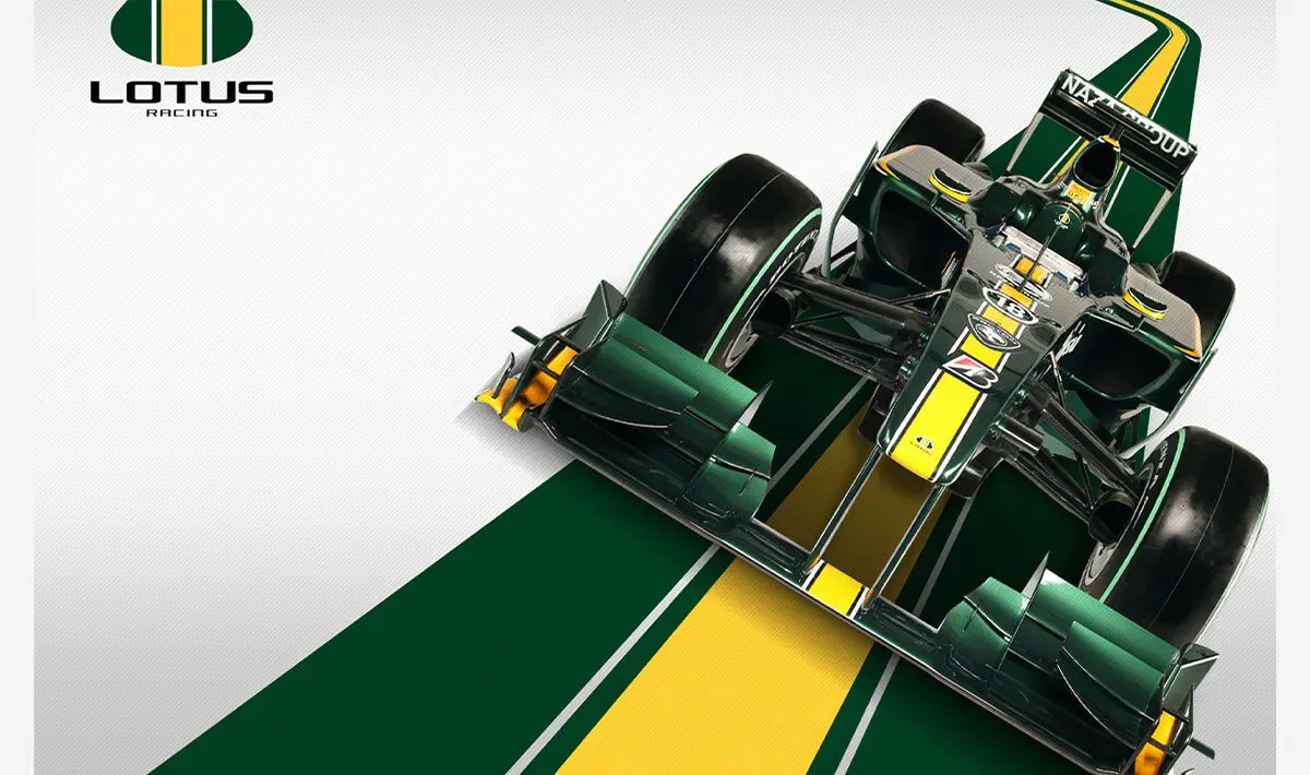
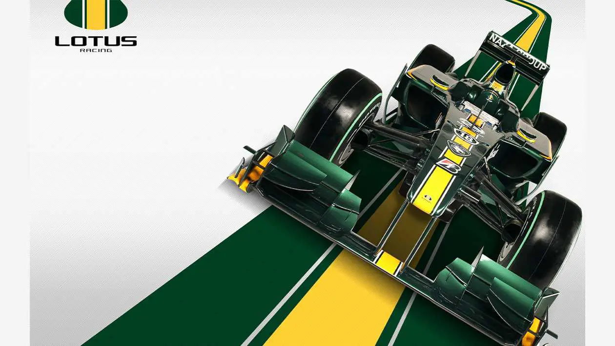
Their trademark logo is a unique brand emblem, first established in 1948, it was designed to set Lotus apart from the other car companies in the industry. Under the Lotus symbol, Lotus cars have been a mainstay in a range of Formula One championships – they have even won the championship 7 times.
Whether you are a fan of Lotus and its sumptuous, agile cars, or you just love learning about the most beautiful and memorable logos, then this history of the Lotus cars logo will satisfy that desire to educate and inform.
Lotus history: The Lotus logo today
The Lotus Car Company logo is an image that is instantly recognisable in the motoring world, with its bright yellow motif. Some would say it is far removed from other modern car logos we know, having often been crafted in metallic shades, the Lotus logo clearly presents the bold confidence of the brand.
The Lotus logo has had a unique colour palette over the years, which has evolved into an iconic monogram. Despite its evolution the shapes within the symbol have not changed too much since its inception.
You can see that today’s Lotus logo uses a bright yellow, circular background, with a dark green, curved triangle in the foreground. According to the company, the edges of the triangle are rounded to represent the shape of a lotus flower.
The LOTUS text on the monogram is written in a simple sans-serif font, in the same intense yellow as the background colour. It looks like the word and monogram have been cut out of the Lotus logo triangle.
The evolution of the Lotus Car symbol
The symbol for the Lotus car was created when the company began back in 1948. Since then the features of the Lotus logo have not changed too much, with many of the same elements in the logo today.
1948
The original logo featured a black, circular badge with a narrow silver outline. In the centre of the circle was the marque name, curving in line with the triangular shape with rounded edges. Above LOTUS was the monogram for the brand – the letters “ACB” entwined inside of a larger C. These letters represent the name of the brand’s founder, Anthony Colin Bruce Chapman.
The chosen typeface was sans-serif, intended to represent an abstract lotus flower, according to the Lotus Car Company.
1984
The black circle design remained for 36 years, only changing in 1984, when Lotus made an unusual update to its emblem. The triangular “lotus flower” shape remained but the circular shape was widened slightly to make it look closer to an oval. Colour was added too, with the designers changing the black background to a dark green and the typeface and border to gold.
1986
The monogram was removed on the first version of this design, but two years later it reappeared. Perhaps Anthony’s ego got the better of him. In this revised version, the logo’s font was updated to a serif typeface, with the letters overlapping each other.
1989
In 1989, Lotus decided to update its logo back to the original circular badge shape, keeping the curved triangle in the centre. The dark green remained unchanged, emphasising its importance to the Lotus brand, while the word “Lotus” and monogram changed to light silver.
The serif typeface no longer overlapped, improving readability, while a silver outline bordered the curved triangle and circular badge. The golden background behind the triangle had been lightened to a yellower shade.
They introduced a monochrome version too.
2010
The logo was updated slightly in 2010, becoming more modern and refined. Specifically, the yellow became slightly brighter, and the outline border was adjusted. Additionally, the redesign gave the silver more texture, making it look more metallic.
This composition looked similar to the one that came before it. The difference being that this time it seemed a lot more modern – similar to the sort of badge one might expect to see on the back of a car.
2019
In 2019, the Lotus Car Company seemed to follow a similar strategy to various technology companies by simplifying its logo. The majority of the design remained the same, only becoming more flattened and minimalist. The silver outlines and the texture elements were completely removed, and the shade of yellow was turned brighter. It also became the colour inside the monogram and LOTUS text, which switched to a sans-serif font.
Lotus Cars symbol meaning
The Lotus logo represents the simplified shape of the Lotus flower, rather than being a random assortment of shapes.
The dark green symbolises wealth and nature, highlighting Lotus vehicles’ premium status and the beauty of the environment.
The bright yellow highlights Lotus cars as happy, innovative, and exciting. It’s an intriguing colour choice, widely associated with racing, partly due to Lotus Cars’ effective branding efforts.
Lotus Cars logo colours
The colours of the Lotus logo have changed a few times over the years, evolving from a basic black and white logo to the iconic rich green we know today. Moreover, today’s bright yellow builds on the previous golden shades, which were used to represent wealth and sophistication by the brand.
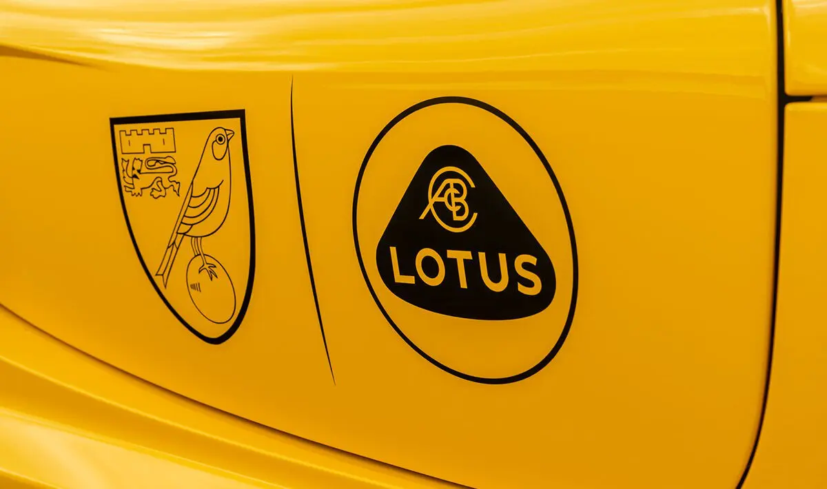
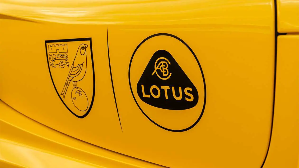
The colour palette now does an effective job of attracting attention and generating excitement for the company. Additionally, these reasons, along with the yellow and green combo, may have something to do with Lotus’ partnership with Norwich City FC. However, that’s not the reason the logo didn’t make my top 10.
For all you designers out there, the finer details of the colours are:
British racing green:
RGB: (0, 66, 37)
Hex: #004225
Canary yellow:
RGB: (255, 239, 0)
Hex: #FFEF00
What font is the Lotus logo?
The Lotus logo uses a minimalist sans-serif typeface. This is a basic and straightforward font made specifically for the Lotus Car brand. The typography has changed a few times over the past 70 years, often switching between serif and sans-serif options.
The type of font used for the LOTUS text has been the same as the font used in the monogram of the logo.
What does the Lotus logo present?
Today, the Lotus logo is an icon of premium sports car performance. Despite being unusual compared to most vehicle logos, the bright Lotus logo successfully makes the company stand out. Despite my appreciation of the Lotus logo, it didn’t quite make it into my top 10.
Tap here to find out which 10 logos made it into the best car logos of all time.
Read more on
Advertise your Car Show on My Car Heaven.
Get in touch and we can make that happen for you.
Find Out MoreRelated Stories
Advertisement Advertisement
 Advertisement
 Advertisement
 Advertisement