


Does Alpina Make it into the Best Car Logos of All Time?
The Alpina logo places higher than its parent brand BMW on my list of the best car logos of all time. Both would make my top 20 logos but don’t quite make the top 10. You can view my top 10 here.
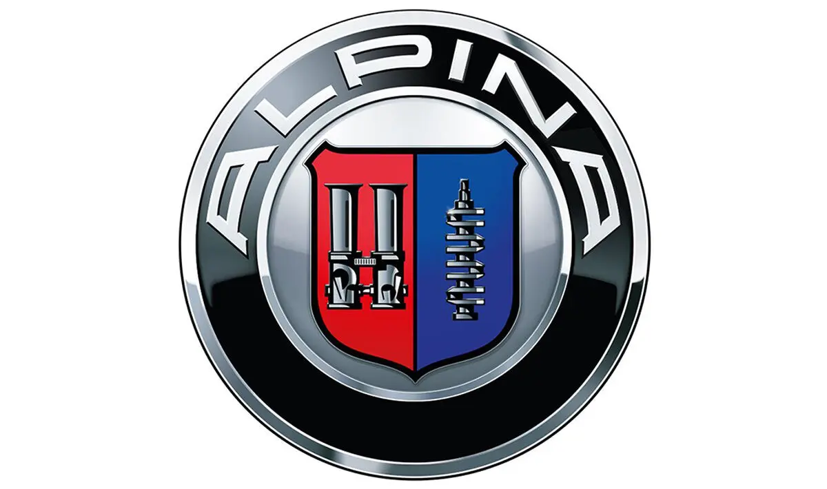
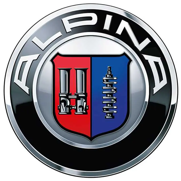
What appeals to me more in the Alpina logo than in the BMW logo? Well, it has more colour and pictures of car components that make it much more appealing. The emblem displays a black ring, similar to the BMW, with ALPINA in large white letters, encircling a red and blue shield.
This is a logo that has been making petrolheads’ hearts’ beat faster since 1967. In today’s blog I’ll share with you the fascinating story behind its creation, what it stands for, and its evolution over the years.
Meaning and History
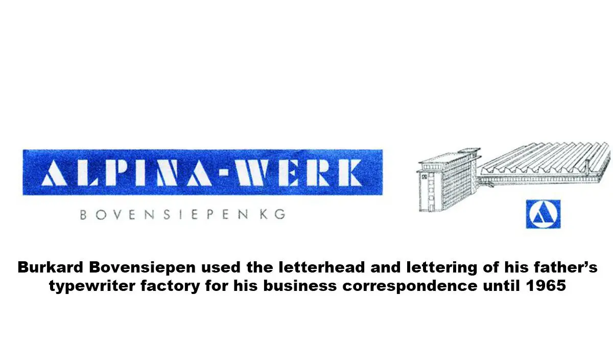
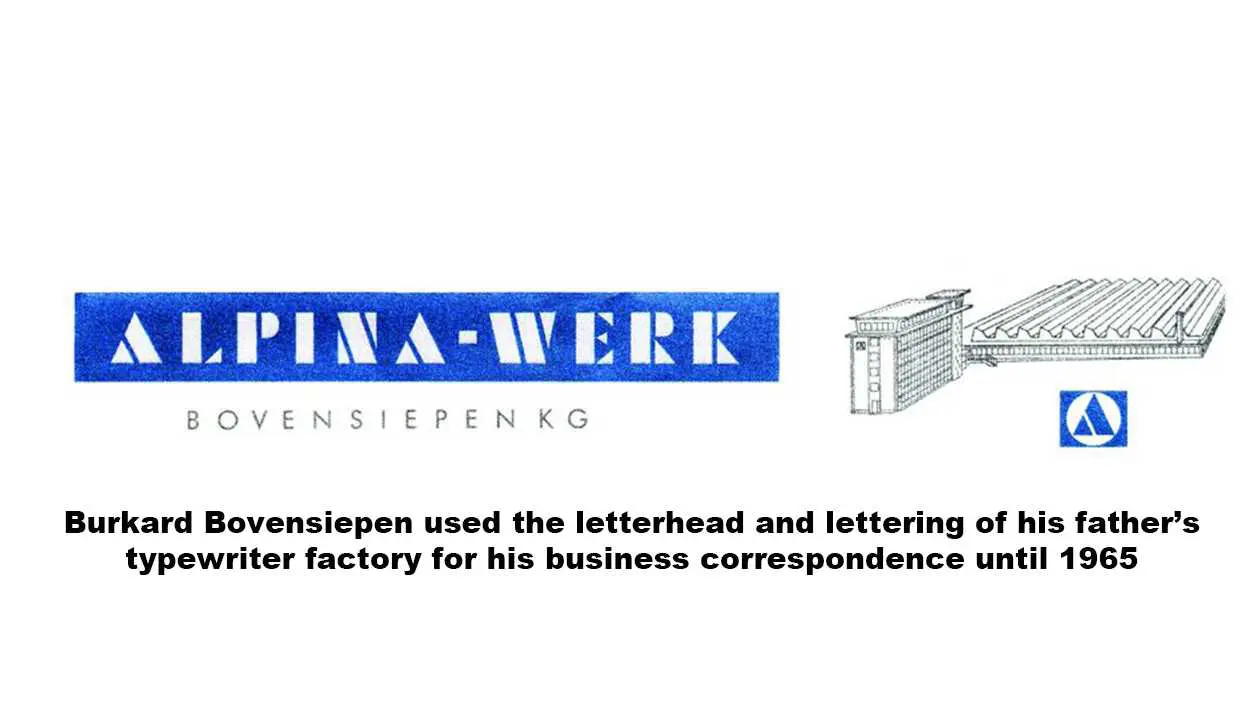
Let’s start with a charming tale concerning the birth of the company name. The home of ALPINA is in Buchloe, Munich, where there are picturesque views of the Allgäu Alps. One might think the founder, Burkard Bovensiepen, was inspired by these mountains, but the name came from his mother… and had nothing to do with the alps. It started on the site of the typewriter factory that his parents owned in Kaufbeuren in the Allgäu. Burkard simply ‘borrowed’ the title of the ALPINA typewriter business for his new company.
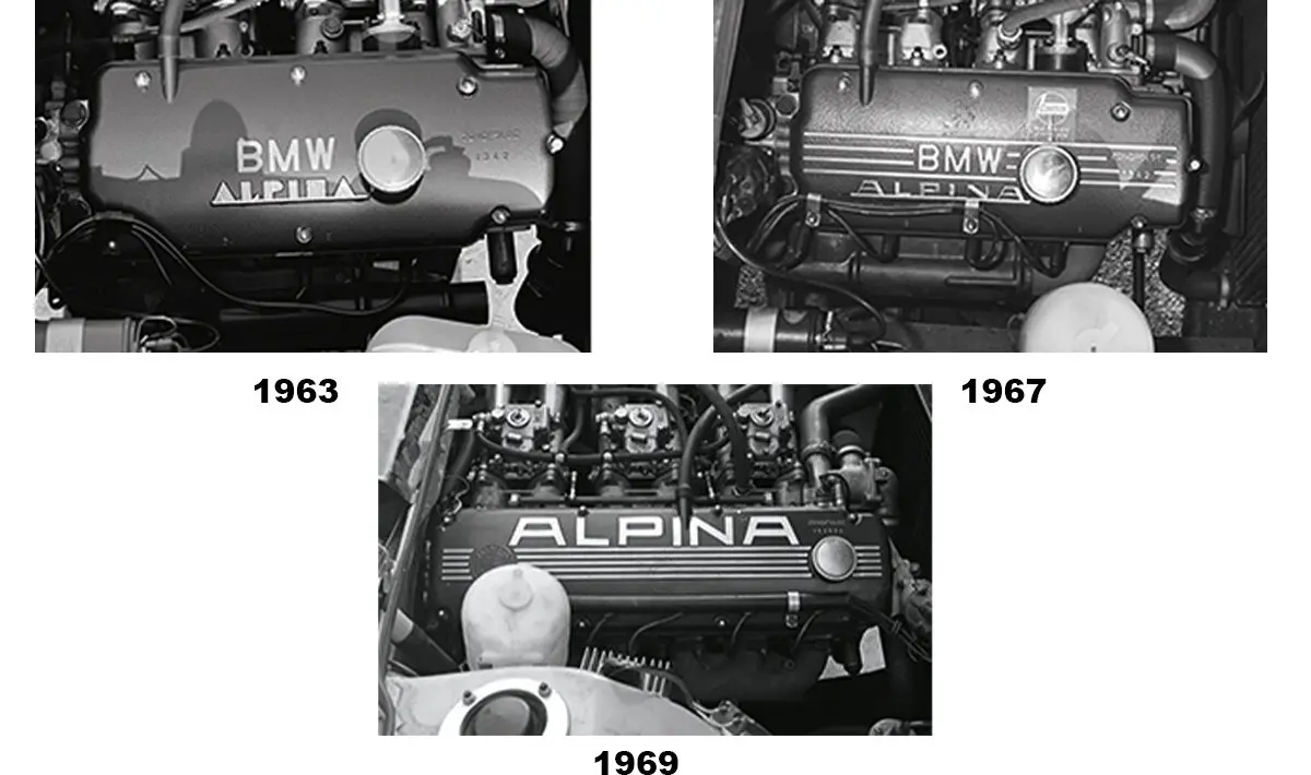
The brand went into business in 1965 as a base for Alpina Burkard Bovensiepen KG. Initially Alpina specialised in the production of elite small-series sports cars, spare parts, and tuning of finished cars produced by BMW. After many years it has established itself as a manufacturer, coming out of the shadow of BMW and delivering exceptional cars.
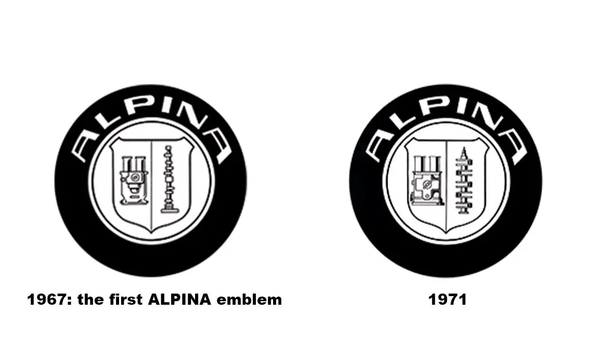
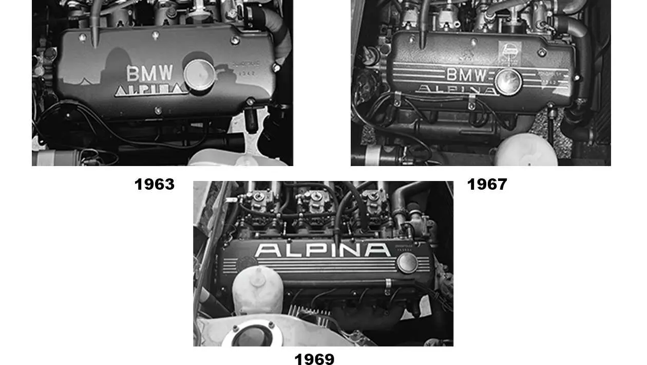
In the company’s early years its product range grew – and with it Burkard’s desire to have an emblem to complement the lettering. He wanted it to be round, reminiscent of the BMW logo, but his first Bavarian design with white and blue diamonds went down like a led balloon with his partner BMW. As soon as he had presented it at the 1967 International Motor Show IAA he was told that he was prohibited from using it.
A New Design
Nevertheless, necessity is the mother of invention. Burkard, being the entrepreneur he was, presented a new design in the same year. The ALPINA emblem was born at a time when there was a lack of interest in traditions and heraldry in particular. Still, Burkard was always good for a surprise!
Even though Alpina is a division of BMW, the concern is never presented in the logo. Although the form of the Alpina logo is reminiscent of BMW, and this is the only reminder of the parent brand.
The basis of the emblem of Alpina is a classic coat of arms, vertically divided into two parts. This classic, heraldic structure emphasises respect and adherence to the best traditions. The modern form presents the desire for the ideals of the future.
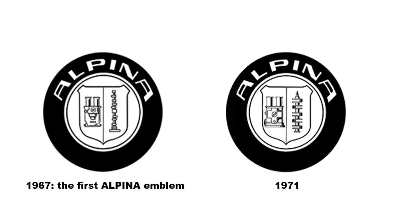
As you can see from this first design of the ALPINA emblem, it depicts a dual carburetor and a camshaft. ALPINA chose these because it focused on these engine components at the start of its business operations. At that time, the name of the game was to increase the power of carburetor engines. They redesigned the emblem again in 1971, replacing the camshaft with a crankshaft to symbolise engine capacity and torque.
Symbol
The symbolism of the Alpina logo starts with its respect for traditions; emphasising the importance of the three circles included. Two of them “protect” the brand name, with the third – the heraldic image – placed in the centre. This further emphasises its elitism and its need to satisfy the wishes of true gourmets of automotive art.
Font
The company chose a font for its logo with a uniform thickness of lines, a thickness that matches the width of the lines of the three circles.
Colour
In terms of the emblem’s colours, it uses five it we count black and white as colours: black, white, silver, and in the heraldic structure – blue and red.
1974
Single throttle and crankshaft
Since 1974, the logo has depicted a single throttle to reflect the new ALPINA engines that featured a modern throttle and injection system, which replaced the dual carburettor. The ALPINA emblem to this day signifies the chief development goal of the ALPINA engineers: to make running smoothness and torque superiority a reality for every new BMW ALPINA model through its technical finesse.
Alpina’s motto, attributed to Oscar Wilde, says it all: “I am a man of simple tastes. I’m always satisfied with the best.”
2002 – Present
BMW ALPINA
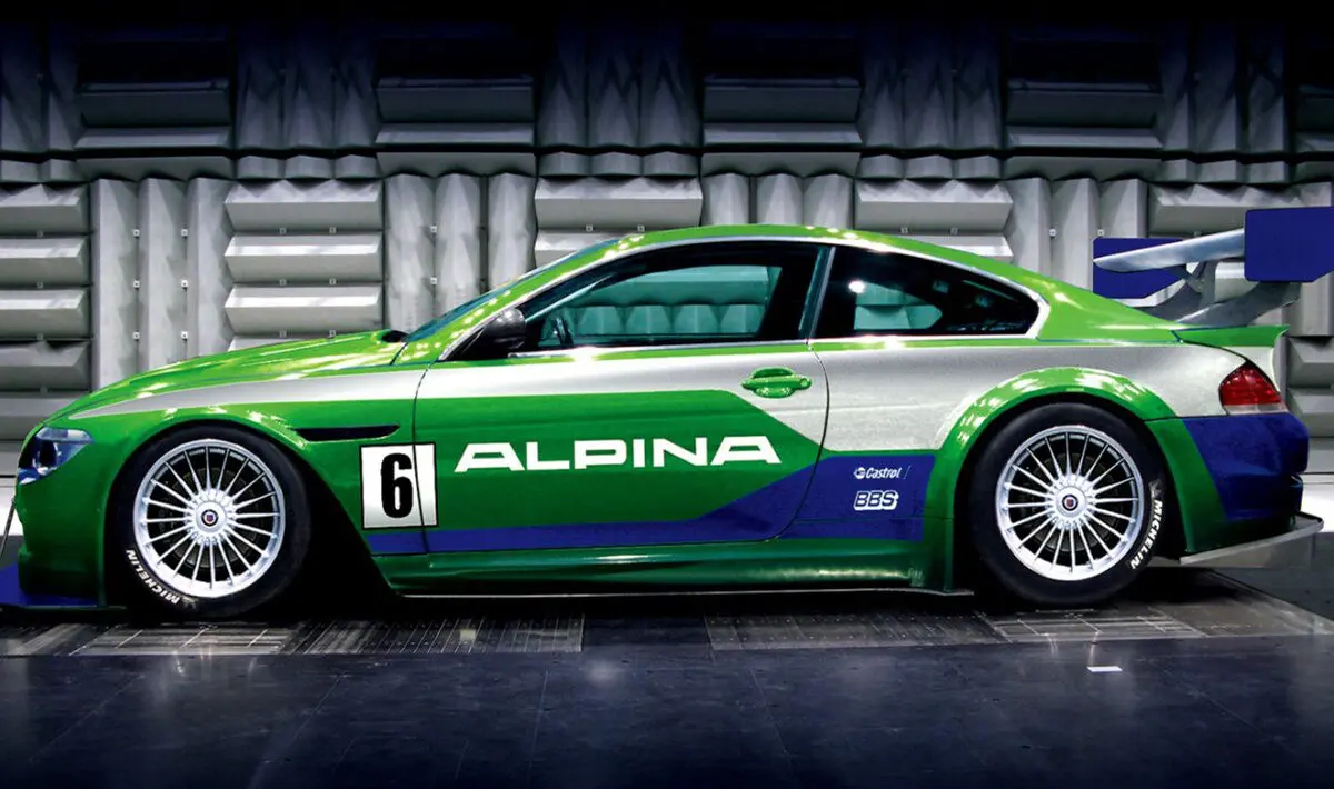
A word of caution; if you see an ALPINA emblem on the front or rear of a car, be suspicious. A genuine BMW ALPINA car would never deny its roots, they proudly bear the BMW emblem. The ALPINA emblem appears on the exterior of a car only when it’s a genuine ALPINA wheel set or in the engine compartment.
Despite my appreciation of the Alpina logo, it didn’t quite make it into my top 10.
Tap here to find out which 10 logos made it into the best car logos of all time.
Read more on
Do you have a passion for cars? Would you like to join the My Car Heaven team?
Get in touch, we'd love to hear from you.
Find out more Advertisement
 Advertisement
 Advertisement
 Advertisement