


Abarth Takes 2nd Place in the Best Car Logos of All Time


What’s not to love? The colours, the scorpion, it’s just cool.
Abarth is an Italian road car and sports brand, as well as a manufacturing division owned wholly by Stellantis. Founded by Carlo Abarth in 1949, he named the company after his surname and set up the headquarters in Turin, Italy.
Meaning and History
Abarth & C.S.p.A. is the company’s full name. It’s one of the divisions of FCA Italy S.p.A. and produces sports and road cars. Despite being located in Italy, its principal owner is the Dutch company Stellantis N.V. Corporation.
Carlo Abarth was co-owner and sports director of the racing team of Cisitalia, but realised in 1947 that the company was on the verge of collapse. The following year the company closed, and one of its other co-founders, Piero Dusio, moved to Argentina. Carlo was able to secure financial support from Armando Scagliarini, the father of Cisitalia’s racing driver Guido Scagliarini, and transferred all of the assets of the failed plant to himself. Together with Guido, in the spring of 1949, a new company arose from Cisitalia’s ashes – Abarth & C. Its headquarters were located in Bologna, but moved two years later to Turin.
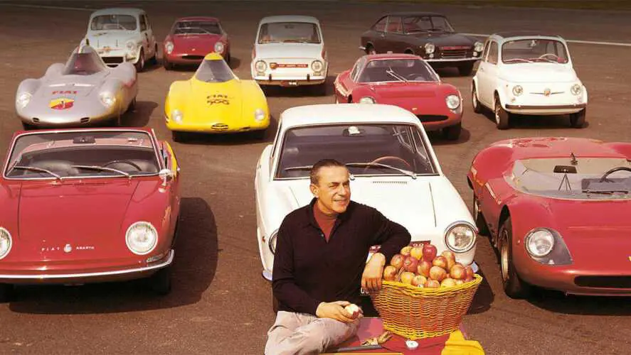
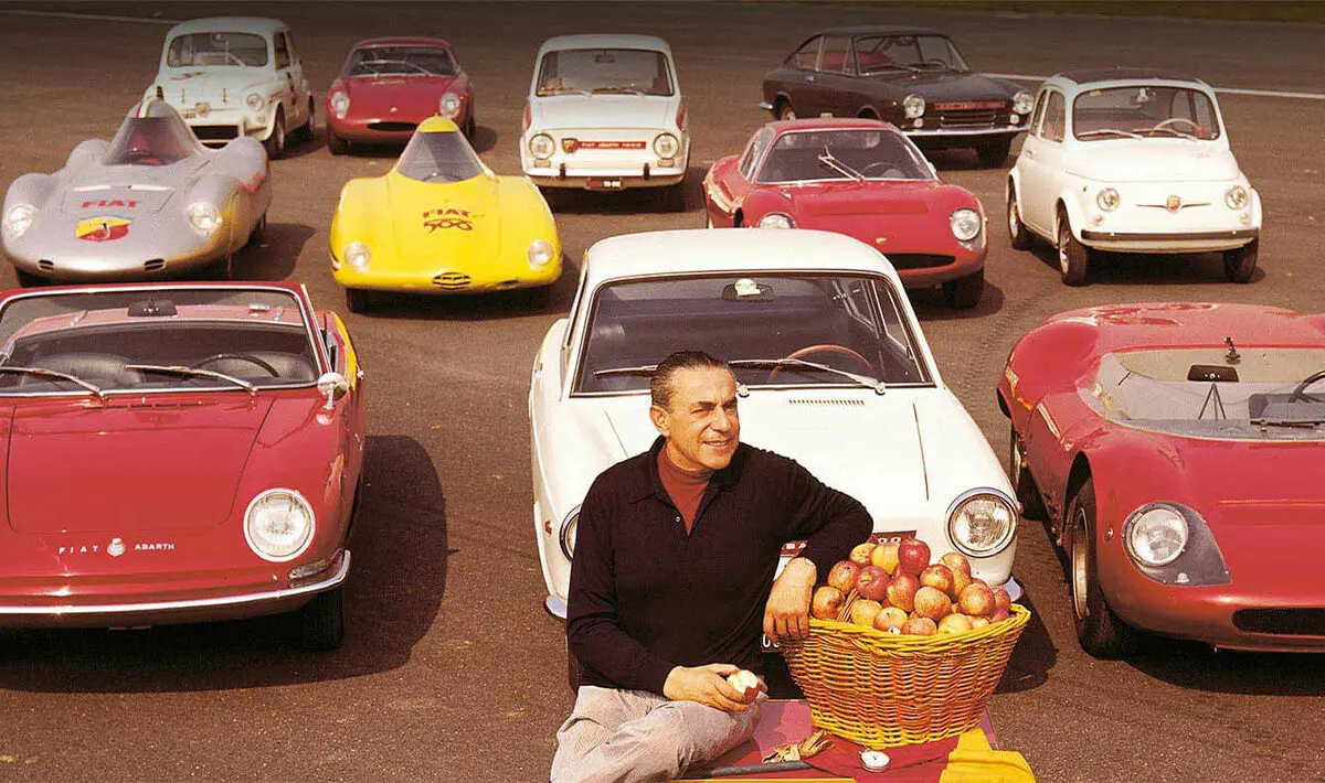
Abarth received 204 sports cars following the liquidation of Cisitalia. This included one single D46 car, and many other accessories. Every vehicle was immediately renamed and were raced under different names. Most of the latest models were announced for the races. Famous riders competed in the latest models, drivers like Guido Scagliarini, Tazio Nuvolari, Franco Cortese, and Piero Taruffi. It was Piero that won the Palermo-Monte Pellegrino Cup on the Abarth 204 A in April 1950. Though it was Carlo Abarth that was the true racing maestro. He clearly had the mind and skill for racing from his childhood exploits. He was just 11 used a leather belt to cover the wooden wheels of his scooter to allow him to go faster and beat the older children in his neighbourhood. Be it scooter, motorbike, or racing car, Carlo was a winner. Remarkably, he even beat the Orient Express! In the saddle of a motorbike, he took on and beat the famous Express train, travelling over 850 miles from Vienna to Ostend.
Carlo’s career as a racing driver evolved to his ownership of Abarth & C. As well as racing, the company produced and sold car parts and accessories for Simca, Lancia, and Fiat. It was with Fiat that Abarth started a business partnership to build the Abarth 1500 Biposto range from its vehicles. The company achieved great success in the 60s with its 850-2000cc class sports cars. Its main competitors were Ferrari and Porsche.
As the company specialised in assembling racing cars, it paid utmost attention to its image. From Abarth’s beginning, a formidable scorpion was present on the hood, displayed defiantly against a bright red and yellow background. The scorpion was chosen by Carlo because of the zodiac, it was the sign under which he was born. It symbolises high energy, fearlessness, leadership, and invincibility. As shown below, the emblem has never changed over the years of the brand’s existence, only minor adjustments outside of the basic concept.
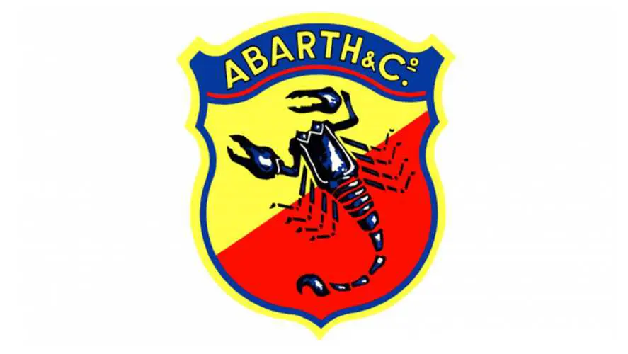
1949 – 1954

The debut version of the logo was a simple depiction of a scorpion, above the company’s name. The designer of the emblem was Carlo Abarth himself, whose talents weren’t confined to designing automobiles. He wanted to display the scorpion as close as possible to a realistic image, so he kept many physiological details. The intricate structure of the little side paws, the notches on the claws, the amount of segments on the tail – it was all carefully created. It was designed to intimidate rivals, inspired by logos of sports teams. No surprise considering Guido Scagliarini was a highly regarded football player in his younger years. The colour palette was restrained, with several shades of bluish grey next to black. The text counteracted this with a bold red: it highlighted not only the name of the company but its location too.
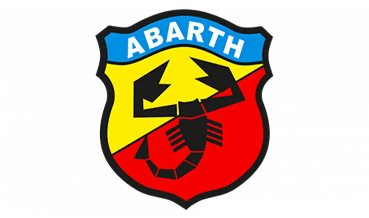
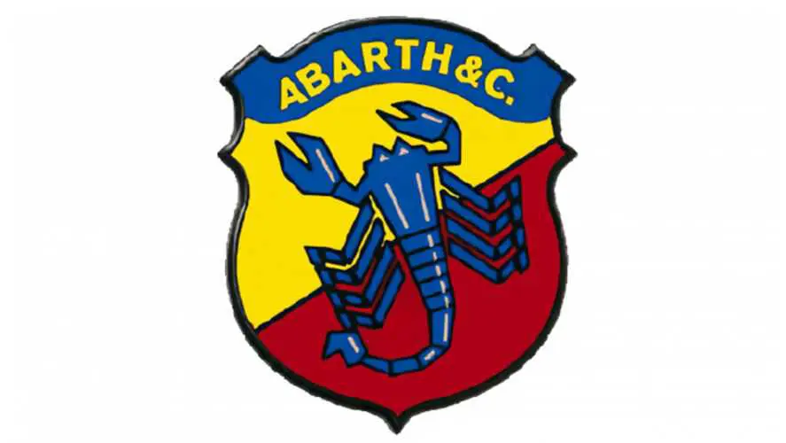
1954 – 1961
To next rebrand emphasised the competitive spirit of the brand, placing the scorpion on a sculpted shield atop a bright colour. Yellow and red were chosen by the designer, giving adrenaline to the emblem; balancing tones of excitement and fear. These colour zones were divided by a diagonal line, inside a thin blue outline that thickens at the top. The company’s name was moved up to this part of the shield, now in bold yellow, arching up and down with its red underlining. To accentuate the power of the logo it was given a yellow outline, slightly thicker than the blue outline.
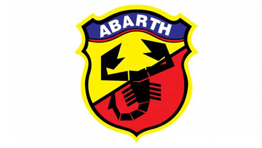
1961 – 1969
During this time Abarth’s sports cars had success, leading the owner to add originality to the emblem, choosing to abandon the intricate detail of the scorpion. It was painted the same blue as the background to company name. The blue outline was changed to a single thin black outline, emboldened with a white outline to give it a 3D look. The artistic style of the image changed from an aggressive and detailed feel, to a schematic and abstract tone. The artist thinned the lobster’s legs, reduced the segments of the tail, increased the pincers, and added white highlights on its body.
1969 – 2007
During this lengthy period the blue in the emblem was replaced by purple and black. The amount of purple was minimal, serving only as a background for the name “Abarth”, now without “& C”. The black was used to fill the even less detailed scorpion, and thin outline. The scorpion style was now in the Cubist style. The lettering of “Abarth” stayed bold, but was now white. Its red arching underline to returned. The yellow got a pastel shade and was the most dominant colour, once again bordering the entire shield.
2007 – Today

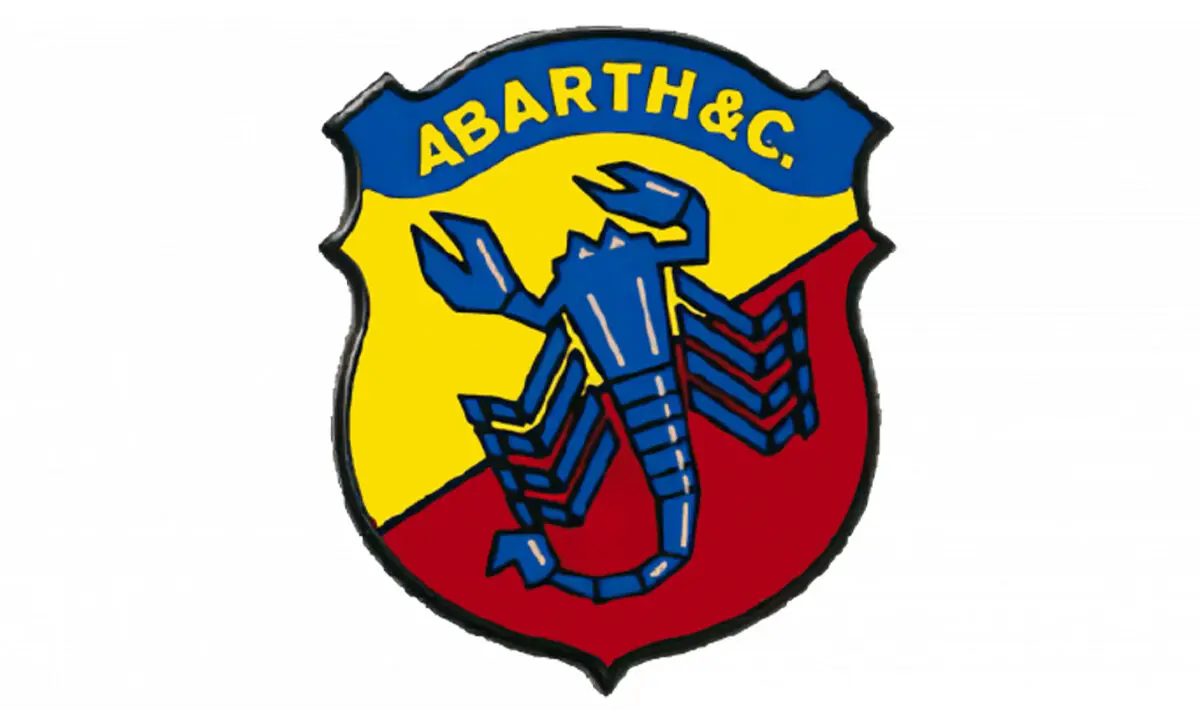
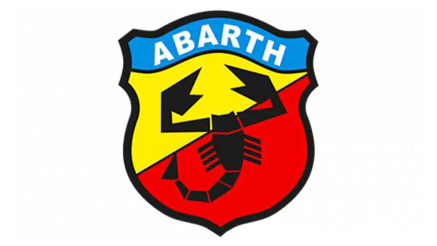
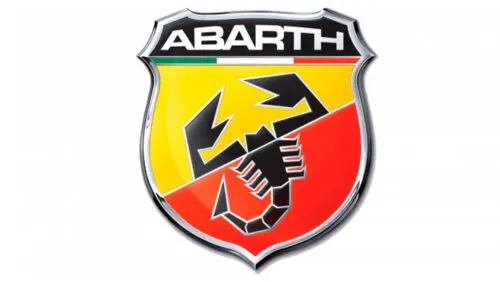
This version the designers filled the emblem with the spirit of patriotism, by using the colours of the Italian flag beneath the brand’s name. This turned the red dividing line between this and the scorpion from red to green, white, and red. The shield’s width was widened and “Abarth” was increased in size and gave an arched shape to the inscription. This gave the letters a difference in height, arching from small on both sides up to the tallest middle letters. The emblem was made to look like a metal shield by designing the edge like a metal frame with highlights and shadows. The scorpion was placed precisely on the diagonal strip, visually dividing it into two parts. The claws and head are in the yellow zone, the body, legs, and tail in the red zone.
Font and Colours of the Emblem
When Cisitalia was rebranded as Abarth its owner chose the image of the scorpion, and since then that arthropod has remained present in the identity: only its drawing style has changed.
The inscription’s typeface was originally close to Microgramma D Bold Extended. This font was authored by Alessandro Butti and Aldo Novarese. The font Grammara Normal Font, created by Thomas E. Harvey, is its closest free counterpart.
The logo’s colour scheme consists of yellow, red, white, and black. Throughout its 70 year life its palette has had periods of blue, purple, and green added to it.
Click here to find out which car logo came in 1st place in the best car logos of all time.

Read more on
Have a Competition you’d like to advertise on My Car Heaven?
Get in touch and we can make that happen for you.
Find Out MoreRelated Stories
Advertisement Advertisement
 Advertisement
 Advertisement
 Advertisement